6 most forgotten UI states for great software

Have you ever wanted to rub scorpion chillies in your eyes while pressing the buttons on pedestrian lights multiple times?
I have.
Is it working? Does it know I want to cross the road? Panic! There's usually no way to know whether the button was already pressed or if it's even doing anything at all!

I have also had nightmares about old school elevators that I've pressed the button for 47 times because that would summon it faster....right?
Why?
Lack of feedback!
A simple LED light would improve the experience manifold!
Software is a space where data transforms with or without user interaction.
When there is user interaction, it is usually through a user interface. A user interface transitions between various states upon interaction to deliver a user experience. And good software needs to account for various states of the UI to deliver the best user experience possible. Here are some of the oft forgotten design decisions I believe have a great impact on GUI software quality.
1. Empty States
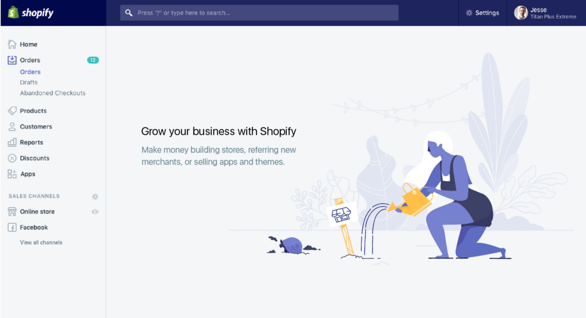
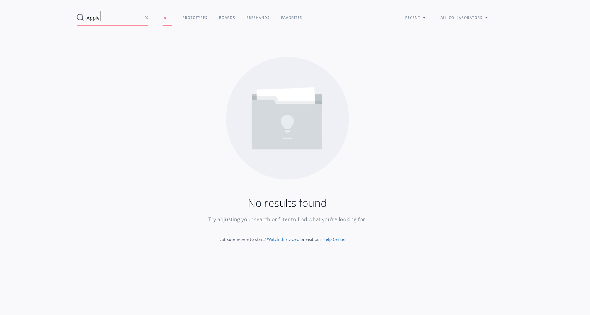
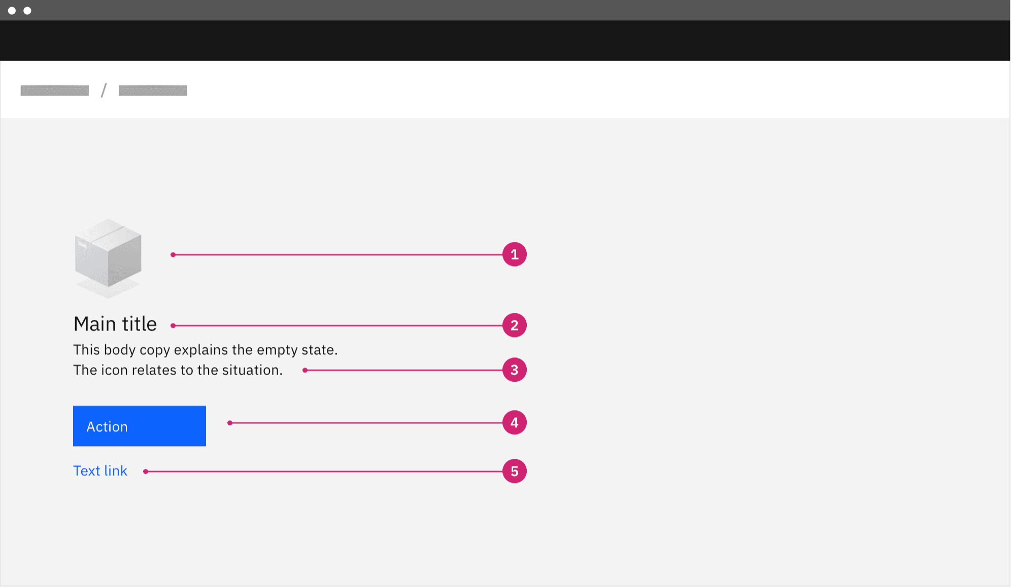
One of the most overlooked ones! A lot of the time, when a UI holds no data, we need to show the user that there is nothing here and, in many cases, give them affordances or guide them to fill the emptiness by performing certain actions.
Sidenote: what's up with this grammar?

2. Overflow States
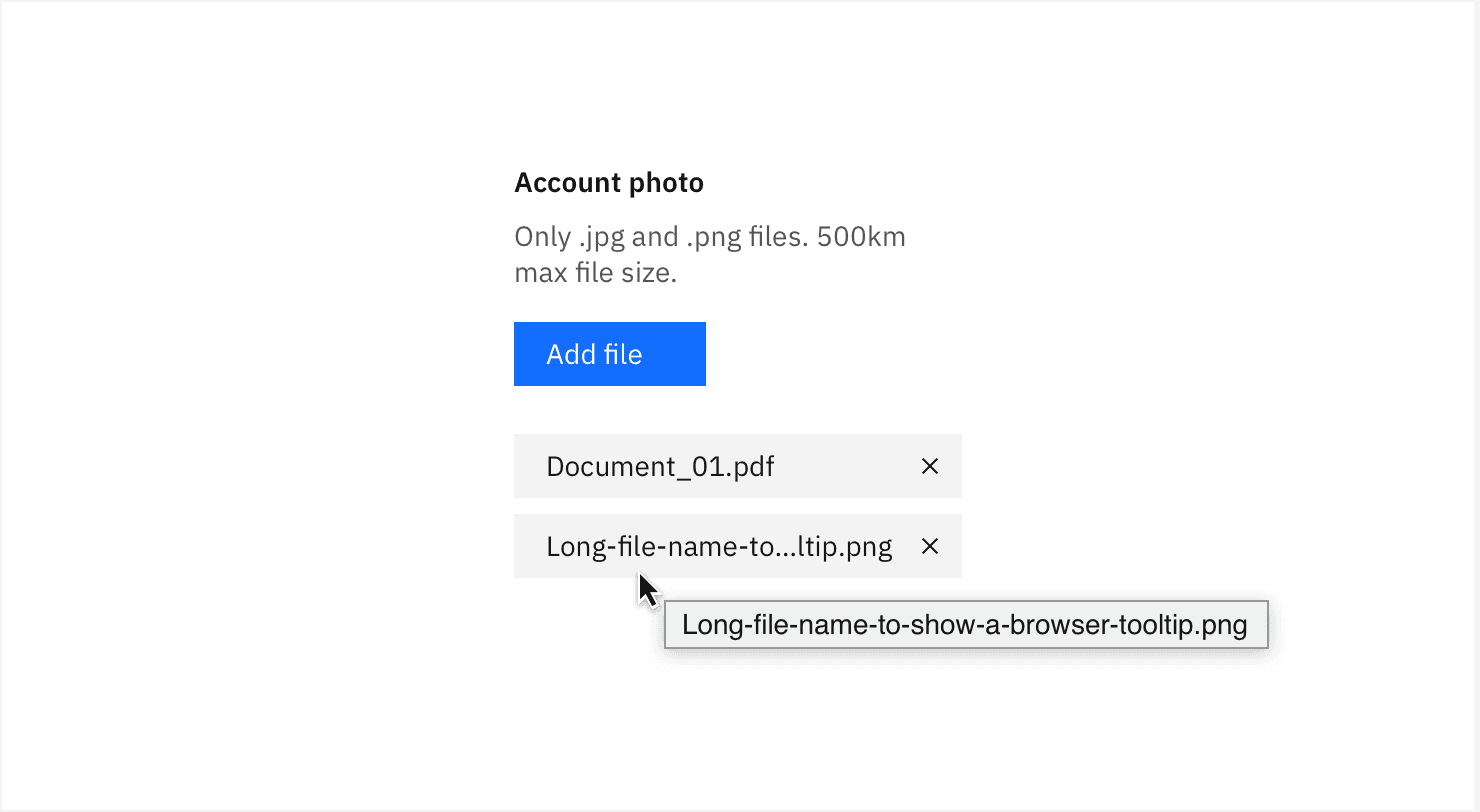
This is the opposite of empty states. More often than not, we have more data than a UI container can hold without disrupting the aesthetics or obliterating the user's cognitive load. Overflow states need to be accounted for in designs.
- Do we scroll horizontally/vertically, or do we use infinite scroll to load more when the user hits the bottom?
- Do we wrap content or let it clip?
- Do we use single-line truncation or multiline truncation of content?
- Do we avoid false bottoms or show an arrow to indicate there is more content?
- How do you handle content overflow in a modal or a popup?
These important questions must be answered early because they drastically change the software design and implementation logic!
3. Loading States
While transforming our data, there is usually some form of latency because every computation takes a finite amount of time. This latency could occur either while fetching data for the first time or fetching new data to eventually render to screen. It could also occur when you transform data from one form to another. Giving the user immediate feedback is always a good idea. It increases the perceived performance of the application while also giving them peace of mind that the software is working as expected. Immediate feedback can be something like a skeleton loader. These have become quite popular in the past few years to show loading to the user while the software fetches data in the background, usually for the first time.
Another form of loading feedback could be progress bars or spinners, but make sure to use determinate elements over indeterminate elements wherever possible.

Users prefer to know the progress of the feedback as it gives them something to watch, like Messenger telling you your friend is typing .....or Windows "file/copy" letting you know there are only 4 days remaining on your file transfer 😜.

4. Success States
When things go right with an important task or action, celebrate 🎉

It is best to prioritize this feedback class only for important actions because people usually expect things to go right!

5. Disabled States
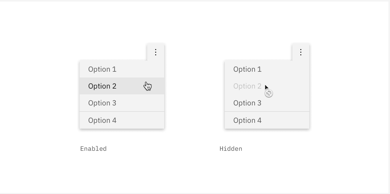
Often we need to prevent the user from making undesirable data transformations while an operation is already in progress. We generally do this by disabling buttons while in progress or hiding certain UI elements, etc. Sometimes when an action is not idempotent, it can lead to data integrity issues and cause the system to behave pathologically!
6. Error States
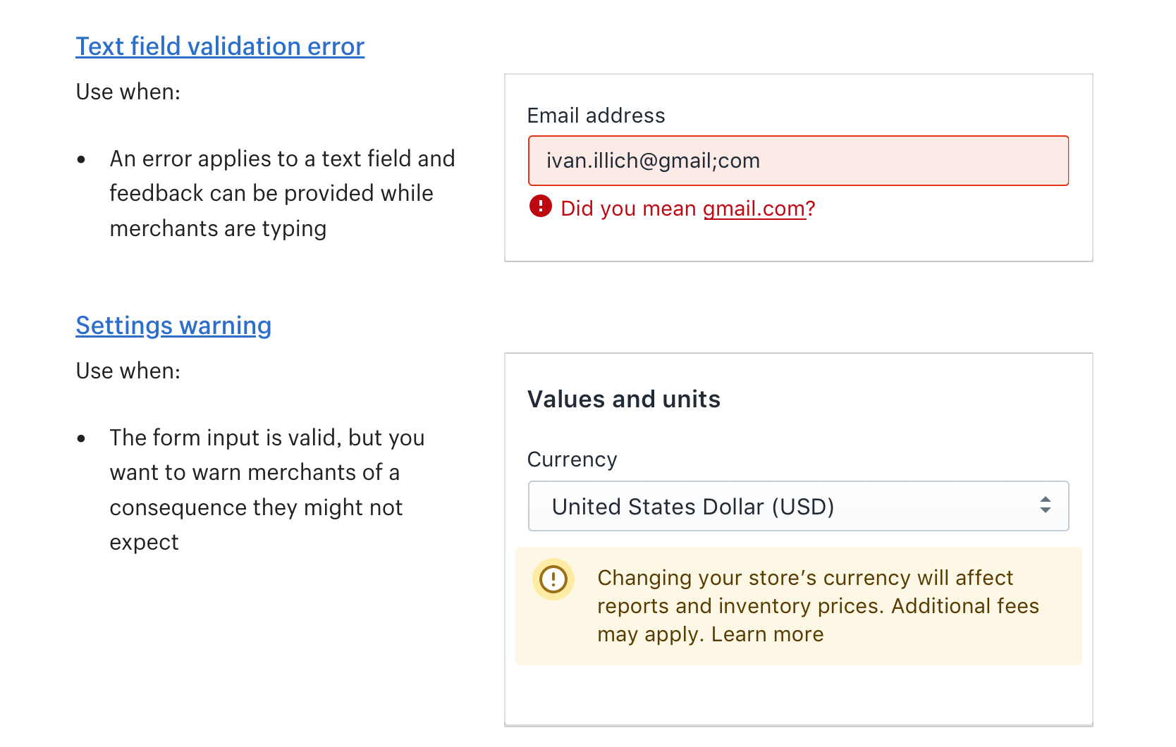
We often walk down the happy path and forget about the unhappy one when software leads us into the abyss! Unfortunately, failure is inevitable, and some users will always hit the edge cases. It is good software hygiene to account for errors while writing code, wrap your code in try...catch blocks like burritos, add the catch block to Promises and Futures, catch your async errors and correlate them, and distinguish between kinds of errors and log them for diagnostics. Give the user feedback when something has gone critically wrong. Tell them we tried and failed! This makes an important difference to the user.
Conclusion
That's all, folks! Software and design go hand in hand. Some key design decisions have a drastic impact on both usability of the software as well as the maintainability of the underlying codebase.
Feel free to reach out and let me know your thoughts ;)
Happy Engineering!
